MI Start Map
A dashboard that tracks the COVID-19 pandemic’s spread across Michigan through key epidemiological indicators.

A dashboard that tracks the COVID-19 pandemic’s spread across Michigan through key epidemiological indicators.
The COVID-19 pandemic is still sweeping our world, and the United States still has some of the highest case and death counts of any country in the world. Even with widespread access to vaccines, the US has lost over 800,000 lives to the virus. In particular, my home state of Michigan saw the third highest death counts of all US states in the early stages of the pandemic.
State politicians and public health officials are in the unenviable position of making decisions that will affect both lives and livelihoods, for better or worse.
Because COVID-19 is a global phenomenon, many of the tools quickly developed to track its spread are broad in scope. In the US, the Centers for Disease Control and Prevention (CDC) has a COVID surveillance website, but because it provides data for all 50 states, it is not well-tailored to meet the needs of decision-makers in Michigan.
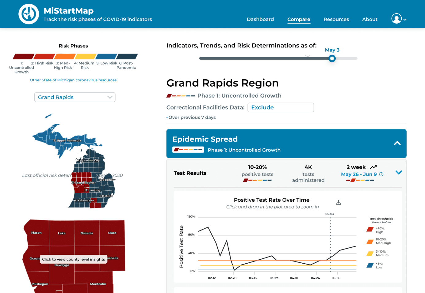
We designed MI Start Map, a COVID-19 dashboard that tracks the pandemic’s spread across Michigan through key epidemic indicators, as developed by state epidemiologists. Users can view live data at state, region, and county level, and track progression through the MI Safe Start risk phases at the state, region, and county level.
The urgent nature of the pandemic gave our project a super-fast timetable, which made the research and development process unique. We used an agile development process with 1-2 day sprints. This led to multiple pivots within the first two weeks of the project, as the requirements and scope were iteratively developed alongside the product. Research and design were being run in parallel by our UX team, while our development and data integration teams worked on building the back-end systems.
UX Researcher
Lead Designer
April 2020 - October 2020
Remote
Our foundational goal for this project was to support two user groups: public health and government decision-makers, and the public. From this goal, our first two requirements emerged:

Prioritize this user group to assist in their pandemic response

Ensure public access to the same data that government officials use for decision making to ensure transparency and trust
The day after signing onto the project, the original 3-member design team brainstormed and wireframed our initial design. We worked with our faculty lead to gather requirements from Michigan Department of Health and Human Services (MDHHS) authorities and our advising epidemiologists from the University of Michigan School of Public Health (UMSPH).
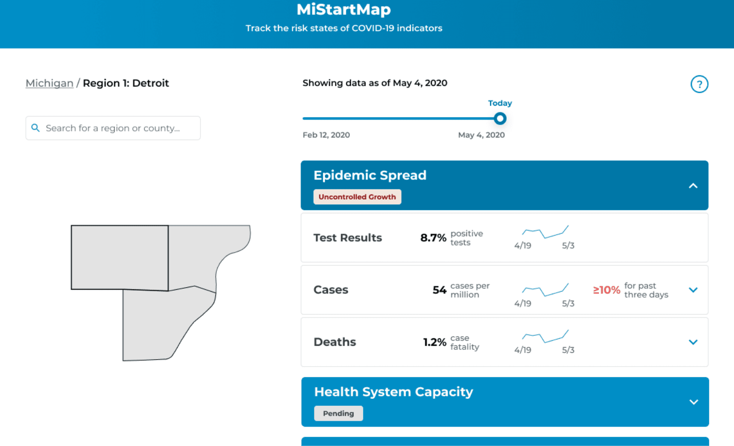
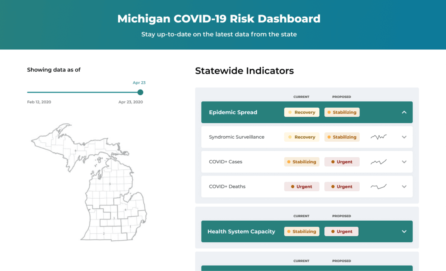
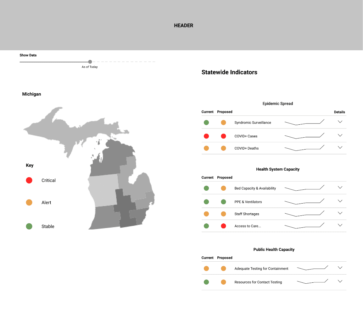 Statewide Indicators
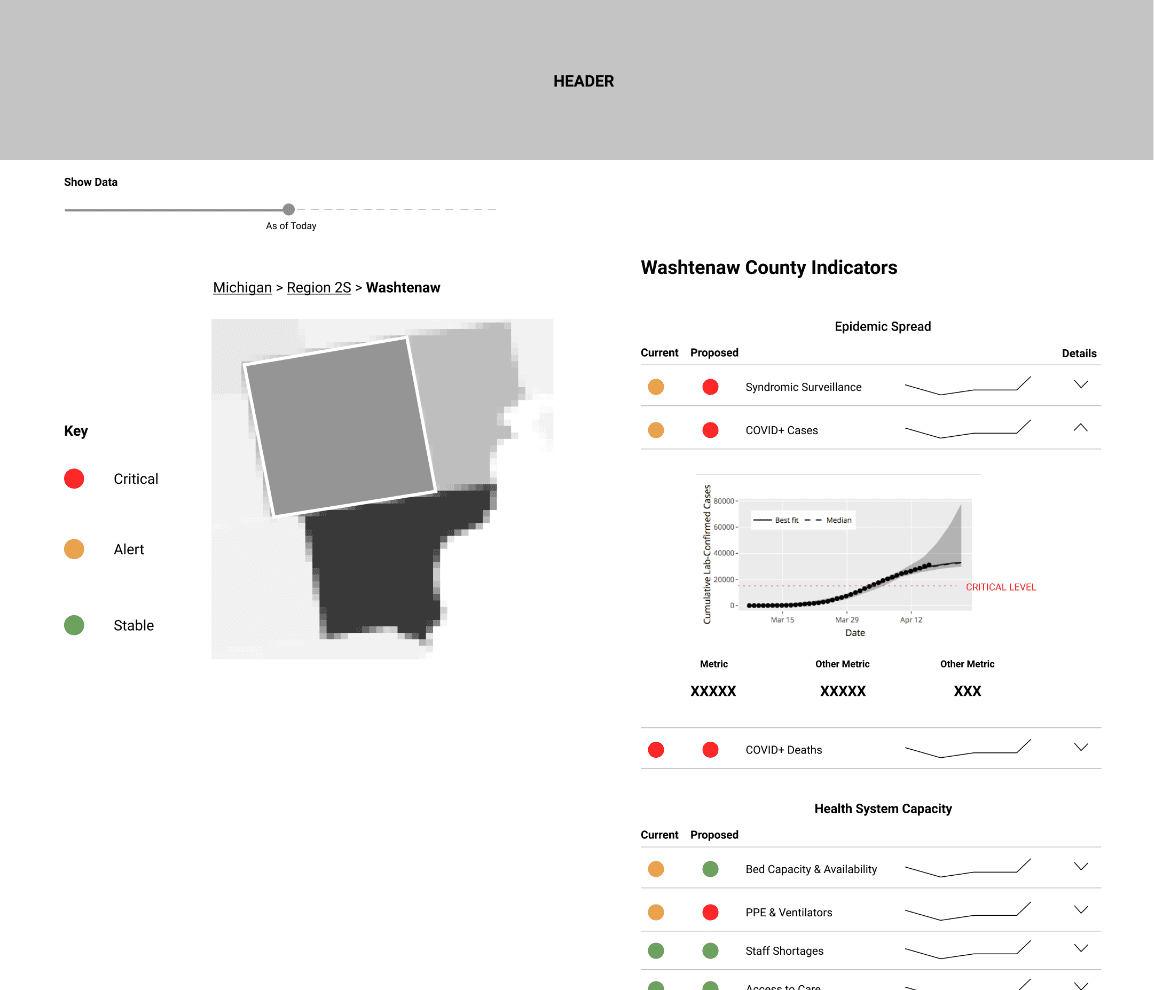 Expanded County Indicator
One of our big risks early on was the inability to talk to either of our user groups. Government decision-makers and public health officials were already overwhelmed with pandemic response. Public users were off the table until our data pipelines were set up correctly (so as not to cause panic or confusion with dummy data). Given these constraints, we ran our early interviews and user tests with epidemiologists and PhD students from UMSPH. They were already involved with COVID response work, but had not seen the interface, making them the best proxies for our government user group. You can view our UMSPH interview protocol here.
To help our UX and development teams better understand and empathize with our user groups, we created four personas from a synthesis of interview results and secondary research on US public health systems.
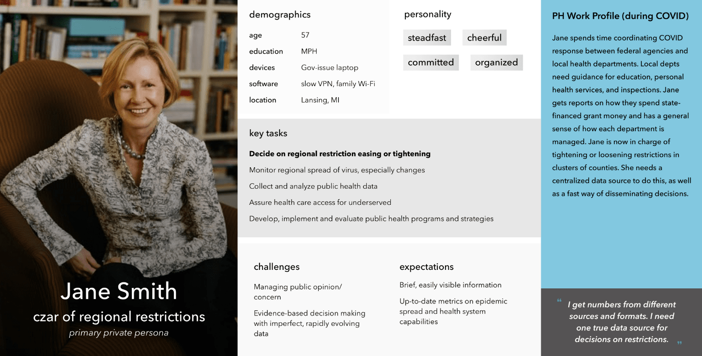
Jane represents state-level public health officials, such as those at MDHHS, who are responsible for public health decisions that inform state and regional restrictions.
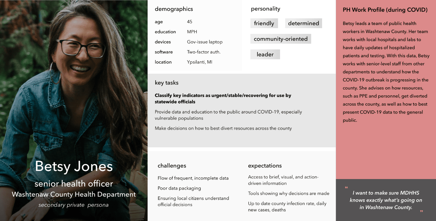
Betsy represents local public health officials across the state. These local officials are responsible for having in-depth familiarity with pandemic metrics in their city/county so that they can lead their locale’s response to potential outbreaks and inform state officials of their status.
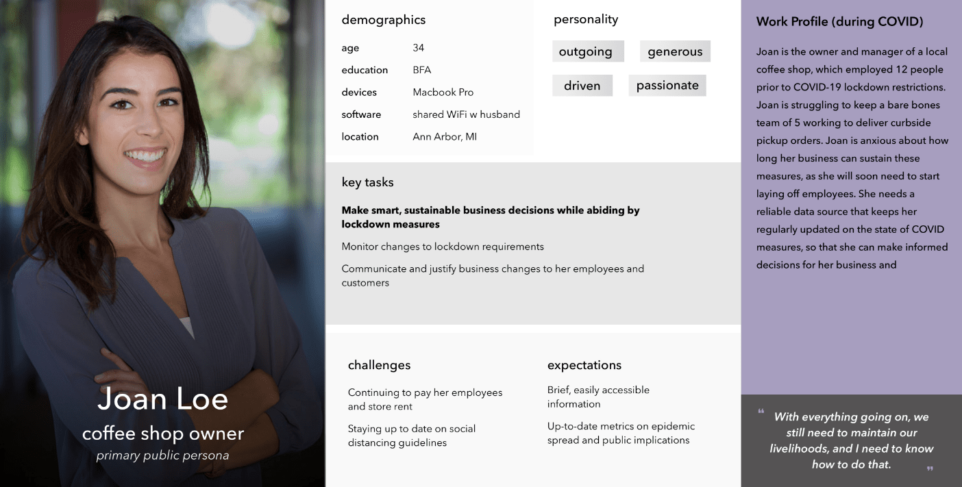
Joan is our small business owner (SBO) persona. Many small businesses and restaurants in Michigan have been greatly impacted by COVID-19. SBOs we interviewed detailed their anxieties about the pandemic as they wait to reopen while making ends meet in between.
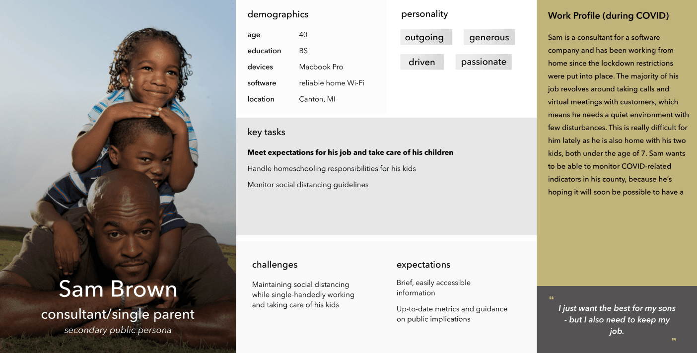
Sam represents workforce individuals who are fortunate enough to work from home, but still have their share of worries about the pandemic, especially with regards to their children.
From here, our team worked in parallel streams to experiment with two possible implementations for the dashboard: a version in Tableau, (a commercial off-the-shelf (COTS) data visualization software), and a ground-up web solution.
Designing in Tableau was intended to be the quickest solution, where we traded development time for interface appeal. But the tradeoffs ended up being too costly: we were working with significant UI constraints, slow response time, and clunky navigation. And, as a COTS software, Tableau requires costly licenses for access, which public health officials (let alone the general public) did not have.
All these factors taken together convinced the team that Tableau was not a feasible solution.
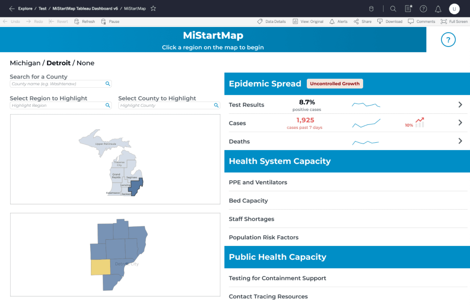 Tableau Version
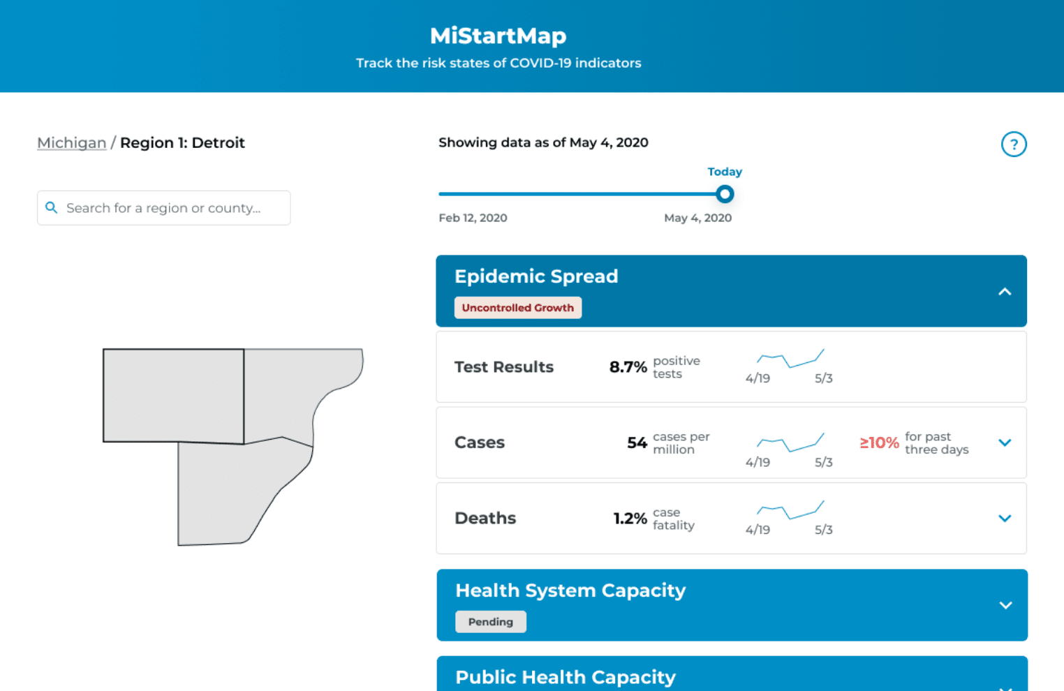 Web Version
So, we focused our efforts on building a web dashboard from the ground up.
Since we were unable to run user testing with public users before our launch, we ran a series of heuristic evaluations to catch any major usability issues.
We ran one for each web mobile. Each evaluation was run independently by three researchers; independent findings were aggregated into a single sheet of recommendations. The design team reviewed the results of each heuristic evaluation with our development team to improve usability pre-launch.
On May 26, 2020 Governor Gretchen Whitmer publicly introduced MI Start Map to the State of Michigan. Our dashboard project was just 36 days old.
In this short time, our team had faced countless challenges: pivots, redesigns, late nights, last-minute scrambles, and high-stakes demos — all powered by caffeine and a healthy dose of camaraderie.
Though our first release was cause for celebration, we knew our work had just begun.
We began recruiting members of the public for user testing. This was especially critical for our UX team, because up until this point, we had only tested the dashboard with users who had a high level of education and epidemiology backgrounds. We wanted to find out whether our attempts to make the dashboard easily accessible and understandable for the average member of the public were successful. We also wanted to learn more about real use cases for the dashboard - who was using it, what they used it for, and why.
We asked the following research questions to better understand how our users interact with the dashboard:
All interviews were run remotely using our participant’s conferencing software of choice. Each session was divided into two parts: a semi-structured interview and a user test. During the semi-structured interview, we got to know each participant: their background, their individual experiences during the pandemic, and media consumption habits. The interview then informed the user test, where we had participants run through a series of tasks that were structured to their use of the dashboard.
To keep logging consistent across tests, our team used a rainbow spreadsheet to track user testing observations and flag notable issues. We also logged task data, such as time, success, and satisfaction. You can view a sample of our user testing notes and data logs here.
We ran these sessions with 11 participants from across the state. Some of our major takeaways include:
Because of its emergent requirements, this project underwent numerous redesigns and tweaks in a relatively short time. Many of these changes have stemmed from our epidemiology team standardizing pandemic progression indicators with MDHHS and the governor’s office. However, I want to focus on several significant changes that directly stemmed from our user testing with both user groups.
Our initial design had quickly glanceable mini-trendlines intended to show trends for the most recent two weeks of data. However, we uncovered significant conceptual issues with our current implementation of time navigation - especially for the trend lines and their relationship with the date slider. When moved, the date slider would show all data as of or up until the chosen date. The trend lines would show the past two weeks of data for the chosen date (so if the slider moved back to 5/13, the trend line would display 4/29 - 5/13). This became confusing for users who had different expectations of what the trend line should display at any given time. We also observed users forgetting that they had moved the date slider, and would read trends incorrectly.
 Before
 After
After
We solved these inconsistencies by incorporating trends directly into the raw data graphs. Now, when the date slider is moved, a marker moves along the graph to show current date selection. Additionally, the graph is clickable and can be used for time navigation in the event that the date slider is overlooked by the user.
Our vision for MI Start Map was for it to serve as a tool that public health officials could use to make informed decisions about lifting/imposing restrictions. While the dashboard still supports that vision - it has a different mechanism than we originally planned.
We initially showed the current risk phase (set by an MDHHS official, based on data). Beside it, a new phase proposal recommended by a system algorithm was displayed. If current and proposed phases were different, health officials would know to investigate the status of the county or region. User testing with epidemiologists uncovered concern about status proposals and how they were supported by raw data. We also knew displaying them for the public had the potential to cause confusion and disturbance surrounding official risk categorizations - but hiding them went against our goal of transparency.
 Before
 After
After
We decided to eliminate the status proposal mechanism and in its place, we designed our rainbow icon system. The minified rainbow icons show current risk level and overall position within the 6-phase system. The current risk levels in features are generated by the system based on thresholds set by MDHHS officials. In turn, officials can look at risk levels for each indicator for a given region and determine which of the 6 phases to place it in.
Note: We later moved away from the “rainbow” colors, which were also being used by Michigan Department of Labor to show economic recovery phases. Government officials asked us to create our own system for epidemiological risk that did not utilize any of the “rainbow” colors. I led this effort and came up with a monochromatic color scheme with a letter rating system. This color scheme is currently in use on MI Start Map.
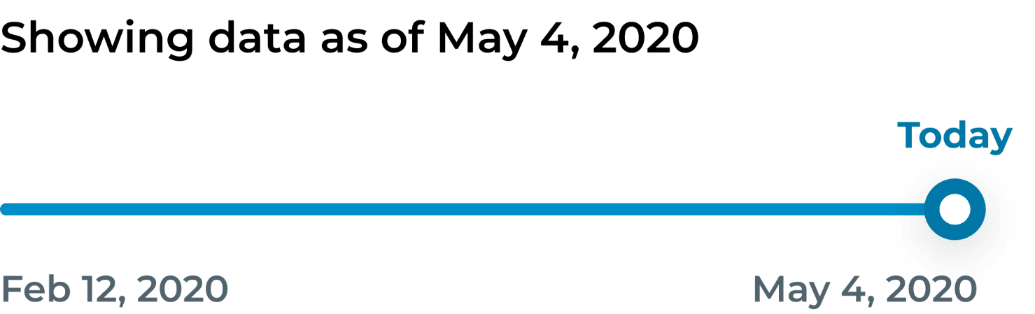
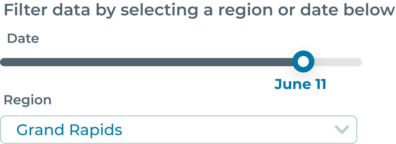
The earliest version of the date slider was cluttered and confusing, so we simplified it to include a single date and a better description of its function.
 Version 1
 Version 2
The evolution of the date slider’s label was particularly challenging. Because the slider simply changes the endpoint for the data, we knew it was important to make sure the label specified that it displayed data as of that date, not only for that date.
We tried labeling the date slider with exactly what it manipulated: indicators, trends, and risk determinations. This worked for epidemiologists and public health officials, but public users were confused by what this label meant, and were often discouraged from using the slider.
The simplified label caters more to public users who don’t have a background in epidemiology but are familiar with common filters. Our previous versions of labeling onboarded public health officials who are now familiar with the date slider.
 Version 3
Note: we later moved from a date slider to a date picker to further simplify the selection of a date, since the pandemic has gone on for so long that selecting a specific date with a slider became nearly impossible. 😭
You can click below to view the latest version of the dashboard. Although I’ve signed off, MI Start Map continues to be updated as the team gains more insight from user research and more requirements from public health officials.
MI Start Map is still relatively young; it will continue to be maintained for as long as the COVID-19 pandemic continues to affect the lives and livelihoods of Michigan residents - which will be for the foreseeable future. After the pandemic, I hope this tool may serve as a framework for building more robust public health tools that support a more effective and preventative response to future public health crises.
Collaborating with other information professionals from different backgrounds, all of whom volunteered their time and energy, was a learning experience on its own. Each person on our team had unique experiences and skills that they brought to the team. I’ve heard it said that with diversity comes conflict, but this team was able to pull together - united by the human experience of living through a pandemic - to come out with an important public health tool, in just 36 days. I am very proud of what we have accomplished, together.
Another important thing I learned was how to own my discomfort with emergent requirements. As a designer/researcher, having at least some established project requirements upfront is comfortable and makes the formation of an R&D plan easier. Because it was born out of a desire to help ease the burden on our state’s decision-makers, this project had virtually no upfront requirements. This made kickstarting the project challenging, but we were able to forge our own way by building off our own skills and design principles, our experiences living through a pandemic, and our knowledge of our primary stakeholders in government. As we iterated through design solutions, we were proactively gathering information from our stakeholders to develop requirements: their goals, their pain points, and tools they wished they had. Getting comfortable with ambiguity and being able to pivot upon formation of new requirements is now one of the best tools in my professional toolbox, and I’m looking forward to honing this skill in the future.